
Accessibility is an extremely important aspect of web design. In many places, it is even the law for websites to be accessible to people with impairments of all types, such as hearing impairments, visual impairments and many more.
In my Digital Production class, we are designing our own web project. In this, I will need to make sure everything is accessible as possible. I have created a list of things I plan on implementing into my website and I want to take the time to discuss them in detail here in case you would like to make your website accessible as well.
Let’s begin. . .
Design Your Site to be Keyboard-Friendly
Design your site with the keyboard in mind. Every section of your website (content, links, pages, etc.) should be accessible without the use of a mouse. Many assistive technologies rely strictly on keyboard-only navigation. You should note that [Tab] is the standard key for navigation. This jumps the cursor between areas on a page and should be implemented into your HTML.
Keep Tables Simple
Tables can be very helpful to get your point across, but they need to be used lightly. If you plan on adding a table to your website, be sure to simplify it as much as possible and make sure it makes sense in table format. Something like a list does not work as a table because the screen reader may read the information out of order, which will confuse the user. Tables can disorient screen readers and should be used with caution.
Avoid Using Pixels
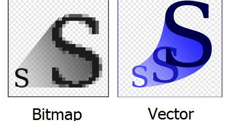
When adding text and images to your website, be sure that they are scalable. Scalability is important to allow the ability for someone with troubled sight to see your content reliably and easily. Many images are made with pixels, which begin to distort the image when blown up to a large size. Instead, try to use scalable vector graphics (SVGs) whenever and wherever possible.
Carefully Choose Colors
About 4.5 percent of the population on Earth is color blind. That is around 3 million documented color-blind people on the planet. Be sure to use colors that complement each other and allow the reader to clearly see the text or image. Do not use clashing colors or similar colors; clashing colors can hurt the readers eyes and similar colors can be difficult to see.
Always Add Alt Text
It is important to have alternative text that accurately describes the image. Alternative text is the text you see directly under most images on the web.

This is intended to be read aloud by a screen reader to people with visual impairments. Without it, the screen reader would read the file name instead (something like 4452a9ae0627f629ae2acd6e6f7839f5) which would be very confusing to the user.
Avoid Flashing Lights
This is something that I felt was not prominently discussed in class for this lesson, because ignoring it can result in fatality. You should always be mindful of photosensitivity. Avoid flashing lights whenever possible. If you do include something that flashes in your website, reduce contrast, avoid red, and provide a mechanism to stop the content from flashing before it starts.
Keep Accessibility in Mind
There are some great tools out there that can make this process much simpler. Here is a list of accessibility tools to help you along the way.
Accessibility is important to every web project you work on. Everybody deserves the chance to experience any website regardless of disability or impairments. I will be sure to apply all of these tips to my own web project and I hope you do the same. See you next week!


