Categories
Class Blog

How to Dodge a Lawsuit: Tips for Finding Reusable Media

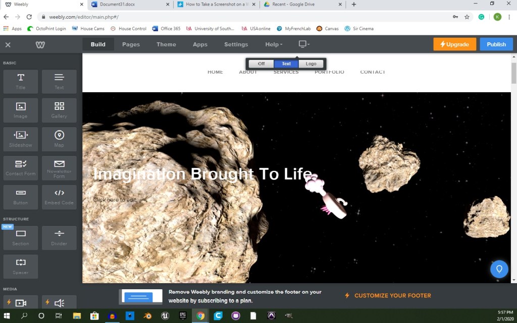
In the wonderful world of media, there is a vast supply of content available to any and everybody to use to their heart’s content. This supply is limited, however, and restricted in many ways. When using other people’s work, the biggest obstacle is known as copyright. In most cases, it is illegal to distribute (and even make) copies of somebody’s work.

While I mostly plan to make my own works for my blog, there have already been and will likely be some situations in which making my own is not feasible. This is sure to be true for you as well when making your own website. For these cases, I have below 5 tips that should help you choose reusable content to use for your own website. 

Tip 1: Make your own stuff.

Making your own images is possibly the safest way to stay away from any chance of copyright infringement. From the moment you create something and fix it in a tangible copy for the first time, you automatically become the copyright holder of said work.

Not everybody has the time or ability to make every single piece of media they need to carry out their task, so, while this is the safest route, it is rarely the most practical.

Tip 2: Create a stock media account.

Image contributed by shutterstock.com, Personal Use Only, DISCLAIMER: I am in no way affiliated with Shutterstock nor do I hold any rights to this image.

Stock media websites, like shutterstock.com, give you access to a large supply of images that are eligible to use for any purpose you desire. This is a great tool if you don’t want/have time to make your own pictures, but there is a down side.

Many of these accounts require a monthly fee of around $30 to gain access to these bits of content. The prices really isn’t that bad for the wide range of reusable content, but it might be enough to warrant searching for a cheaper (FREE) alternative.

Tip 3: Creative Commons is fantastic.

Creative Commons is a non-profit organization dedicated to building a globally-accessible public commons of knowledge and culture. This is where you would go if you wanted to share your work while also securing it as your own. It is also a wonderful place to go to find digital content to use for your own projects.

This is a pretty safe option because it clearly details what type of license each individual work, minimizing your chances of using the wrong thing and getting in trouble for it. I won’t be going into the six categories of licenses offered in this blog, but the most suitable licenses to fit your needs are the Attribution license and the Attribution-NoDerivs license. These are works that are available to use both commercially and non-commercially.

IMPORTANT: Regardless of what creative commons license a person has on their work, it is imperative that you give credit to the copyright holder.

Tip 4: Find public domain content.

Public Domain: No Rights Reserved. Icon for Public Domain. Image contributed by Ahkâm, Personal Use Only, DISCLAIMER: I do not own the rights to this image

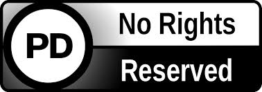
While these can be harder to come by, public domain content is most-often the safest route to take when reusing media. These works have no copyright restrictions and can be modified and used both commercially and non-commercially without any need of giving credit to the creator.

There are a couple issues with searching for public domain content on the web. One is that people are not likely to put their work in the public domain. This would make it impossible to gain any source of income from said work.

That being said, you are not very likely to find a hefty sum of public domain images and videos that suit your necessities. The other issue is that, even when you do find something that matches your idea, it will likely be sub-par in quality. I am not saying that no skilled artists put their work in the public domain, but it is highly unlikely.

Tip 5: Contact the creator.

The best way to go about reusing other people’s content is by simply contacting the creator/copyright holder and ask for permission to use their work.

To obtain permission, there are a few easy steps to take.

  • Determine who the copyright holder is.
  • Contact the copyright holder.
  • Obtain permission to use the work how you intend to.

Sometimes obtaining this permission can require you to pay the copyright holder a fee and sometimes they will just turn you down, but having to pay them or being told not to use it is a much smarter route than using something and finding out later that you are being sued for using somebody else’s intellectual property.

In following these tips, you will be able to add content to any website, blog, or other project you may have without the worry of copyright infringement, intellectual theft, and lawsuits. Happy blogging!

Categories
Class Blog

Tips to Making Your Website Accessible

Accessibility is an extremely important aspect of web design. In many places, it is even the law for websites to be accessible to people with impairments of all types, such as hearing impairments, visual impairments and many more. 

In my Digital Production class, we are designing our own web project. In this, I will need to make sure everything is accessible as possible. I have created a list of things I plan on implementing into my website and I want to take the time to discuss them in detail here in case you would like to make your website accessible as well. 

Let’s begin. . . 

Design Your Site to be Keyboard-Friendly

Design your site with the keyboard in mind. Every section of your website (content, links, pages, etc.) should be accessible without the use of a mouse. Many assistive technologies rely strictly on keyboard-only navigation. You should note that [Tab] is the standard key for navigation. This jumps the cursor between areas on a page and should be implemented into your HTML. 

Keep Tables Simple

Tables can be very helpful to get your point across, but they need to be used lightly. If you plan on adding a table to your website, be sure to simplify it as much as possible and make sure it makes sense in table format. Something like a list does not work as a table because the screen reader may read the information out of order, which will confuse the user. Tables can disorient screen readers and should be used with caution. 

Avoid Using Pixels

Image showing a pixelized ‘S’ on left and a smooth ‘S’ on right. This shows the difference in bitmap and scalable vector graphics

When adding text and images to your website, be sure that they are scalable. Scalability is important to allow the ability for someone with troubled sight to see your content reliably and easily. Many images are made with pixels, which begin to distort the image when blown up to a large size. Instead, try to use scalable vector graphics (SVGs) whenever and wherever possible.

Carefully Choose Colors

About 4.5 percent of the population on Earth is color blind. That is around 3 million documented color-blind people on the planet.  Be sure to use colors that complement each other and allow the reader to clearly see the text or image. Do not use clashing colors or similar colors; clashing colors can hurt the readers eyes and similar colors can be difficult to see.  

Always Add Alt Text

It is important to have alternative text that accurately describes the image. Alternative text is the text you see directly under most images on the web.

“How to Add Alt Text to Instagram Posts” The image above is a link to <socialmediaexaminer.com/how-to-add-alt-text-instagram-posts/>

This is intended to be read aloud by a screen reader to people with visual impairments. Without it, the screen reader would read the file name instead (something like 4452a9ae0627f629ae2acd6e6f7839f5) which would be very confusing to the user. 

Avoid Flashing Lights

This is something that I felt was not prominently discussed in class for this lesson, because ignoring it can result in fatality. You should always be mindful of photosensitivity. Avoid flashing lights whenever possible. If you do include something that flashes in your website, reduce contrast, avoid red, and provide a mechanism to stop the content from flashing before it starts. 

Keep Accessibility in Mind

There are some great tools out there that can make this process much simpler. Here is a list of accessibility tools to help you along the way.

Accessibility is important to every web project you work on. Everybody deserves the chance to experience any website regardless of disability or impairments. I will be sure to apply all of these tips to my own web project and I hope you do the same. See you next week!

Categories
Class Blog

5 Tips for Organizing a Website

Web design can be pretty tough to tackle, but it’s near impossible to do without structure, planning, and organization. Today, I am going to offer five helpful tips I’ve learned along my journey.

Tip 1: Plan your web design on paper first.

designer drawing website development wireframe

Create a basic outline for each of your pages and pencil out a rough structure of your site. This is important because it will help to visualize your site before you put in the effort of actually bringing the idea to fruition. Trust me when I say that erasing a pencil mark is much simpler than reworking the design on a web page!

Tip 2: Everything needs its own page.

Not EVERYTHING, but almost everything should have a separate page from the home page. Think of these as “doors” to your website. Not every user should have to take the same exact door to get in. Each individual service you offer should be a potential entryway into your site.

By having multiple landing pages, you multiply the chance of someone ending up on your website through their surf. It also reduces the amount of traffic on one particular page at a time, while maintaining the same amount of traffic overall.

Tip 3: Keep track of your content.

It is wise to keep a few lists on hand when designing your website:

For every page, you will need a link. A list of your main navigation links (e.g., Contact Us, Our Services, etc) can be a smart tool to have. It will help ensure you don’t forget any important pathways and can help keep you on track when you are tying up loose ends with your design.

What content do you plan on adding? You should make a list of content you need/want to add to your website. You can also use this to takes notes on where you want certain to go, which will make the process much less stressful.

Tip 4: Use practical categories.

According to web designer Jordan Dick, “If you were a landscaper offering different landscaping services like, ‘landscape lighting,’ ‘landscape design,’ etc., you’d want all those services under one category, on one tab of your main menu.

Chunking relevant content together in a logical way is imperative to a successful web design. The human brain already attempts to chunk information, so this can make a website very pleasing to the eye, but if you fail to do this, finding content specific to the user’s needs becomes increasingly more difficult.

main menu to Australian Framing Solutions’ website, showing one drop-down category being highlighted.

Making sure your content is properly categorized can help with the user’s ability to recall the area of interest within your website for back-tracking or future use.

Tip 5: Keep the main menu concise.

While the main menu of a website can be creative, there needs to be a direct reference in what the site’s primary purpose is.

A user shouldn’t be looking at your main menu and also thinking, “I wonder what this is all about?” Make sure it is obvious at a glance what the user is in for.

By staying organized and keeping track of your content, the road to a well-designed website instantly becomes a lot less bumpy. For more about information organization in web design, click HERE! (don’t worry, it’s not an ad).

Categories
Class Blog

Weeblog: What’s Up With Weebly?

Think about this: You are an aspiring voice actor. You have done some small roles, you put together a demo reel and you are ready to chase bigger jobs.

“How can I show that I am serious about pursuing a career in voice acting?” you ask. The answer? Create a website!

Creating a website used to be difficult to do unless you were well-read in coding and script-writing, but, thanks to programs like Weebly, that is no longer the case.

In my Digital Writing and Production class, we set up Weebly accounts. The goal of this is to design our own portfolios. The process was relatively simple and, since I have (absolutely) no experience with web design, I was very happy to find that the platform is very easy to use. Let me explain my experience.

White ‘W’ in blue square. Weebly.com Logo

What is Weebly?

Weebly is a tool designed to act as an interface on which you can make your very own website. It allows even the least experienced people design any kind of website they want.

Why use Weebly?

Weebly is easy to use, and you don’t have to break the bank to get something worth showing off. In fact, you can make a fully immersive website for free! It also has loads of features that make a web designer’s life much easier.

Some features include:

  • Drag and drop website building makes the process as simple as picking a theme and dragging things where you want them to go.
  • Responsive templates which are easy to edit and include pre-written, easy to change CSS and HTML.
  • Device Switcher which allows you to simulate what your site will look like on different devices.

Also, lead designer at Weebly Wendy Ho had this little trick (mentioned in 5 Website Design Tips from a Weebly Expert) to help even more:

“You can move, copy or delete a lot of things at once: Click the column that divides elements, then click the arrow on the left to copy or the ‘x’ on the right to delete the entire group.”

While Weebly is, overall, simple to use, it can be a useful tool for people learning web design. It still requires some knowledge of HTML and CSS to take full advantage of the customization available, which makes Weebly great to use (as my class is) as a tool to learn how to write custom code.

My Weebly Site

I am in the very early stages of creation.

Screenshot of webpage editor. Image of space, with three asteroids and a regular plumbus. Title reads: “Imagination Brought To Life”

When creating my website on Weebly, I decided to use Typo Designs – Cento 2 as my theme. It is a dark theme, using mostly black with red highlights and white text. I chose this theme because it was the first to pop out at me. I typically do things with a sense of spontaneity, but I also liked the sense of serious confidence that it portrayed. While I do enjoy the theme, overall, I will probably change the layout of the site to better suit my art portfolio.

Categories
Class Blog

To Do or Not To Do, that is the weblog.

When writing for a blog, there is a pretty large number of “rules” for what you should and shouldn’t do. These are put in place to help your blog be readable and easily accessible to everybody. In this post, I will explain how I can apply the practices to my own blog and how they can also apply to a career in the film industry.

There is a wonderful article written by Brian A. Klems titled, The 12 Dos and Don’ts of Writing a Blog that lists (and explains) good and bad practices when writing for a blog. While every item on this list should be considered, I will be discussing a select few that I feel are of the utmost importance in relation to my potential industry.

How can I apply the “dos and don’ts” to my blog posts?

  • Links are a powerful tool to use when writing a blog, as they can be helpful to the reader and the credibility of the content. When used correctly, links can act as a deeper look into the topic at hand, an aid to something complex, or even a portal to a web page that better suits the reader’s needs.
  • Images are important to any blog, because readers “need to be stimulated visually,” according to Klems. By adding images in areas that complement the text, it will increase the satisfaction of the overall experience and make for a more immersive read.
  • Grammar, similar to CGI in movies, is something nobody notices unless it is bad. Ignoring grammar will make you seem unprofessional, uneducated, or just purely careless. By correcting any grammar errors, you can help to guarantee that your blog will be taken seriously. It will also reduce the chances of viewers giving up on the read because it is difficult to follow or understand.

The two images below show how even the smallest details will go noticed if they are missing. The first image, while it looks like a doughnut, is clearly not real because it lacks detail and looks too “smooth.”

Image: Computer generated image of a doughnut with chocolate icing, covered in sprinkles. Created by Joshua Andrews


The second image is of Thanos from Avengers: Infinity War, which looks like a real-life being that you could touch, but is not real at all.

Image: Thanos’ face in front of a light-speckled background. Retrieved from <https://discover.therookies.co/2019/05/06/beginners-guide-to-becoming-a-visual-effects-vfx-artist/>

These are three of what I consider the most important tips to writing a successful blog in a classroom setting. Next, I will discuss a few more tips that I believe better relate to blog writing in the film industry.

How are blog tips supposed to apply to the film industry?

  • Share, share, share to any and every medium that you can. Posting to social media sites, such as Twitter and Instagram, is necessary to reach the largest audience possible. People are constantly being bombarded by posts, links, promos, etc, which makes it easy for plenty of articles and blogs to get pushed “under the fold” of any particular medium. Reaching an audience is a prime goal of film and failing to utilize every available source could result in a fantastic blog with only a handful of viewers (if any at all).
  • Keep it short, sweet, and to the point when writing for film. Over the years, less has become more in the industry, as people are more apt to want more if they are left wanting more (redundant, but true). this can be better understood by watching movie trailers from the 70’s and 80’s compared to trailers today.

As you can see above, the trailer for the original Star Wars (1977) is wordy and explains a good bit of what to expect from the movie. While this is a decent trailer to a fantastic movie, it doesn’t catch my attention as much as the trailer for Star Wars: The Force Awakens (2015) seen below.

This trailer catches my attention from the start, it draws me in to the story and makes me want to go see the film, but best of all, it hardly says anything! It leaves me with questions that I want answered and only gives me enough to crawl back for more.

Now that I have gone through some tips and tricks I have learned to successful blogging, it’s time I explain what steps I will be taking to ensure that my blog posts are worth the read.

What will I be doing to make you like my blog?

Each week, I will work towards curating and customizing my blog page to be simple to navigate for any and everybody. I will do this by utilizing grid formatting to organize my site and including handicap accessibility. This will help make sure I can obtain the largest audience possible while I find my focus.

As I fine-tune my focus, I will thoroughly research my topics so that I am able to give reliable, credible information without chance of misleading my audience. I also will attempt to make every topic as fascinating as I can by allowing my incredibly vast interest in film to seep into each and every blog.

Design a site like this with WordPress.com
Get started